Visual Exploration of Self-Organizing Maps
Using the Grand Tour and Linked Brushing
Zach Cox
EE547 Final Project
Fall 2001
Abstract
The Self-Organizing Map (SOM) is a popular and well-studied unsupervised learning technique. Much work has been done recently on visualizing the results of the SOM algorithm, using static non-interactive approaches. This paper presents two new SOM visualization methods, based on the grand tour and linked brushing. These new methods use animation to show progress of the algorithm in the input space, and interactivity to let the user explore the link between the map in input space and feature space. The new methods were implemented in Java using Jsom, a new Java-based SOM package, and Orca, a Java-based data visualization package. Several different data sets are used to demonstrate the new methods.
1 Introduction
The Self-Organizing Map (SOM) is a very flexible machine-learning tool. It is formulated mathematically as an unsupervised neural network, and during training it can be thought of as a non-parametric regression method to fit a low dimensional map to a data set’s distribution in higher dimensions in an ordered fashion. After training, the SOM can be used for non-linear projection, mapping points in high dimensional input space onto a discrete set of points in a low dimensional feature space.
Researchers have used the SOM in numerous areas. (Kohonen 2001) claims over 4000 research papers have been written about SOM since its inception in the early 1980’s, and lists applications in machine vision, speech analysis, telecommunications, robotics, neurophysiology, chemistry, finance, and many others.
Increasingly, research is being done on how best to visualize the results of SOM and how to interpret these results. For example, (Kaski, Venna et al. 1999) color nodes of the map to accentuate cluster structure, (Vesanto 1999) colors nodes of the map based on their models’ values of single variables, and (Himburg 1998) links coloring between the map in feature space and Sammon’s projection of the map in input space. These visualizations represent the end-results of the SOM algorithm and are all static; that is, the appearance of nodes and models is fixed.
In an exploratory setting however, more insight can be gained about the SOM algorithm. First, since this is an iterative algorithm, an animation can show exactly how the algorithm updates the model vectors of the nodes in the map after each iteration. Since there are a number of parameters needed, (neighborhood, learning rate, etc.) this animation can also highlight inappropriate SOM algorithm parameter values.
Second, allowing the user to interact with several different plots of the map provides a greater understanding of the outcome of the algorithm. Linked brushing (Buja, Cook et al. 1996) between a plot of the map in input space and a plot of the map in feature space provides this interaction.
Orca (Sutherland, Rossini et al. 2000), a Java-based data visualization package, was used for the creation of these new visualizations. Orca features excellent support for basic data visualization tasks such as appropriate data structures, file I/O, and user interfaces, allowing researchers to focus their efforts on processing and custom visualizations. In addition, Jsom was created to handle all of the SOM-related computations. Jsom is a flexible, extensible, object-oriented Java-based package for using Self-Organizing Maps.
2 Self-Organizing Maps
The SOM (Kohonen 2001) is an unsupervised neural network and can be used for non-parametric regression, non-linear projection, dimensionality reduction, feature extraction, clustering, and visualization depending on the interpretation and use of its results. Figure 1 below shows a typical architecture of the neural network.

Figure 1. The SOM as an unsupervised neural network. The SOM consists of an input layer, where the input patterns are presented, and an output layer of connected neurons. These neurons exist as discrete points in some space, in this case 2-D, and each neuron has a weight vector of the same dimensionality as the input patterns.
Each neuron, or node, in the output layer has two vectors associated with it that exist in two different spaces: feature space and input space. Feature space is the space in which the nodes exist and input space is the space in which the data exists. The first vector describes the position of the node in feature space, and the second represents the weight vector of the neuron. Each neuron has a weight associated with each input variable; the lines in Figure 1 represent these weights, and together they form a vector of the same dimensionality as the input data. These weight vectors can also be represented as points in input space; in this case, they are referred to as models since they are the input space representation of the nodes. When referring to the map as a neural network, it is natural to refer to neurons and weight vectors; when referring to points in feature space and input space, nodes and models are used instead.
The goal of the SOM algorithm is to adjust the weight vectors of the neurons to match the training data. One can also think of this as positioning the models of the nodes in input space to match the distribution of the data. The algorithm attempts to do this so that nodes near each other in feature space will have models near each other in input space. Positioning the models to approximate the data distribution can be thought of as non-parametric regression, much like discretized principal curves (Hastie and Stuetzle 1989). The trained map can then perform non-linear projection of data points in input space, by finding the nearest model to the data point and projecting the point onto the model’s node in feature space.
Note that the SOM algorithm is not restricted to working with strictly numerical data. Patterns can be anything, such as text strings or documents. The algorithm just needs to create model patterns for the nodes, and make these models approximate the distribution of the data in an ordered fashion. However, the SOM algorithm used in this project is based on numeric vectors, so that version will be presented here. The algorithm is iterative, and fairly simple:
For each iteration k
Pick a
data point x(k)
Find node c
with closest model mi(k) to x(k)
![]()
Update each model mi(k)
![]()
So during iteration k, the algorithm finds the node c with the most similar model to data point x in the input space. Then all of the models are updated by moving them towards the data point x. The neighborhood function n(c,i,k) returns a scaling value that determines how far each model moves toward x. The model of node c moves the farthest towards x while models of nodes farther away from c in feature space move less towards x in input space (models of nodes “very far away” from c may not move at all). Also, n(c,i,k) goes to zero as k increases so that the models “learn” quickly in the beginning and then are more finely adjusted in later iterations.
Thus, n(c,i,k) decreases with both increasing distance between nodes c and i in feature space, and with increasing k. It is this property of the neighborhood function that ensures neighboring models in input space will belong to neighboring nodes in feature space, and the non-linear projection from input space to feature space will retain the original structure of the data.
Many other ways to position the models in input space exist; thus, the previous algorithm is not unique. Many variants on this original SOM algorithm can be found in the literature (Kohonen 2001), and will not be presented here.
3 The Jsom Package
Jsom is a Java-based package for working with Self-Organizing Maps. Utilizing object-oriented and smart software design principles (Gamma, Helm et al. 1995) (Bloch 2001), it is intended to be incredibly easy to use in a variety of applications, from pure number crunching to interactive demos, while also being very flexible and supportive of customization. A collection of Java interfaces specifies the different parts involved in the SOM algorithm, and is backed by fully functioning default implementation classes, ready for use by the user. Custom implementations are easily integrated into the existing class structure since the API refers to interfaces, not concrete classes.
There are four main interfaces in the Jsom package: Algorithm, Data, Map, and Parameters. These represent exactly what they are named for: the SOM algorithm, the training data, the map (nodes and models), and any parameters used by the algorithm, respectively. Figure 2 below shows a UML diagram for these interfaces.
Many concrete implementations of these classes, performing basic functionality, are also provided in the Jsom package. For instance, the following code is a complete program to read the training data, initial models, node positions, and node adjacency from files, train the map, and print out the resulting models:
import java.io.*;
import jsom.*;
import jsom.data.*;
import jsom.algorithm.*;
import jsom.algorithm.parameters.*;
public class jsomTest {
public
jsomTest() {
Data
data = new FileDoubleData(new File("data.txt"));
DoubleData
nodes = new FileDoubleData(new File("nodes.txt"));
DoubleData
models = new FileDoubleData(new File("models.txt"));
IntegerData
adjMatrix = new FileIntegerData(new File("adjMatrix.txt"));
Map map
= new BasicMap(nodes, models, adjMatrix);
int
iterations = 10000;
double
initialValue = 0.9d, finalValue = 0.0001d;
Metric
metric = EuclideanDoubleMetric.getInstance();
ModelUpdater
updater = FlowDoubleModelUpdater.getInstance();
LearningRate
rate = ExponentialLearningRate.getInstance(initialValue,
finalValue,
iterations);
Neighborhood
neighborhood = GaussianDoubleNeighborhood.getInstance(rate);
PatternSelector
selector = BasicPatternSelector.getInstance();
Parameters
params = new FlowParameters(iterations, metric, updater,
neighborhood,
selector);
Algorithm
algorithm = new FlowAlgorithm(data, map, params);
algorithm.start();
System.out.println("models
= ");
for
(int i=0; i<map.count(); i++) {
System.out.println(""
+ i + " = " + map.getModel(i).getPattern());
}
}
public static
void main(String args[]) {
new
jsomTest();
}
}
Specifying these components as interfaces instead of classes creates a very flexible API. For instance in the above code example, a FileDoubleData instance is created, which implements the Data interface, and is given to the Algorithm. Any other concrete Data implementation could have been used to provide training data to the algorithm. For example, BasicDoubleData, which just wraps a double[][], could have also been used. Or, a user could define a custom Data implementation, and give that to the algorithm as training data. This custom implementation could access any data source, such as a database or some existing data object.
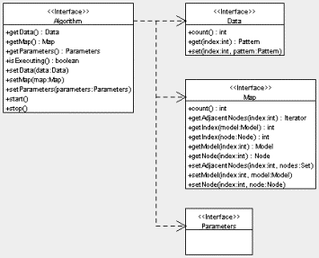
Figure 2. UML diagram for the four main interfaces in the Jsom package.
The interfaces in Figure 2 also reference several other interfaces: Pattern, Node, and Model. These interfaces represent patterns, nodes, and models of the SOM, respectively, and are shown in Figure 3. Again, Jsom can use any class implementing the Pattern interface. A default implementation, DoublePattern which just wraps a double[], is provided with Jsom. However, a class representing a text string could also implement Pattern and be used by Jsom. In this case, a custom Algorithm would also need to be created, to handle the new type of Pattern.
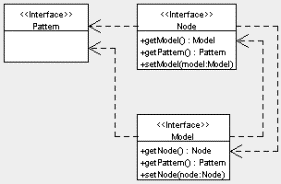
Figure 3. UML diagram for basic data structure interfaces.
Jsom also provides support for event notification (via the AlgorithmListener interface and AlgorithmEvent class), multi-threaded use (via the RunnableAlgorithm wrapper class), and more fine-controlled algorithms (via the ControllableAlgorithm interface). A complete software design description is beyond the scope of this paper, although the above descriptions give a flavor of the overall API design. For more information, please see the Jsom website at http://www.public.iastate.edu/~zcox/jsom/.
4 Implementation in Orca
Orca is a toolkit for producing useful views of data (Sutherland, Rossini et al. 2000). It is written entirely in Java and provides basic functionality for data visualization such as data file parsing, data processing, familiar plots, and user interface management. The software is structured by a pipeline architecture, in which the different pipe sections perform different aspects of data processing and rendering.
For example, a typical pipeline starts with a data source pipe, which is responsible for reading the data from a file into an internal array. This raw data (which is assumed in this project to be in arbitrary p-dimensions) is then passed to a standardization pipe where each variable is standardized, for instance to the range [-1, 1] or [0, 1]. The p-dimensional data may now be projected to a lower d-dimension for display (d = 2 in this project). The d-dimensional data is then converted to display coordinates and rendered for the user in a specific plot. The aforementioned pipeline is a basic, typical setup completely provided by core Orca classes.
This core package is also built heavily on Java interfaces, allowing Orca to be extended easily by end-users to create their own data processing and custom renderings. By providing a few specified methods these custom classes plug-in to the basic API, and gain access to the internal data structures of Orca. This saves an immense amount of development time, as the researcher can focus on specific experimental ideas instead of the rudimentary tasks done by the existing Orca pipe sections. Orca has been used to analyze multivariate time and space measurements in relation to studying the El Nino effect from buoys in the Pacific Ocean (custom time and spatial views of the data were created). It has also been used for research on interaction with graph data, where the nodes and edges have multiple variables.
Orca provides a grand tour (Swayne, Cook et al. 1998) (Buja, Cook et al. 1996) engine for projecting high-dimensional data to 2-D for display. The grand tour creates 2-dimensional projections of the p-dimensional data, and rotates smoothly between the projections. The smooth rotation creates a tour, or movie, of the data, which is very useful in determining the structure and features of a multivariate data set.
Orca also offers a basic scatter plot for rendering the data projected by the grand tour. However, this needed to be extended for rendering the models and connecting lines. Also, a custom scatter plot was needed for rendering the nodes in feature space. Figure 4 below shows the resulting Orca pipeline for the SOM visualization project. Pipe sections shaded gray are custom sections created for this project, while un-shaded sections are provided by Orca. Using the basic Orca pipe sections saved a good deal of time.

Figure 4. Orca pipeline for the SOM visualization project. Custom pipe sections are shaded gray.
The above pipeline creates the two Orca plot windows shown in Figure 5 below. The main plot shows the grand tour view of the data points and models in input space. The user interface on this window controls execution of the algorithm, the map topology, and configures the brushing used on the plot. The second plot shows the nodes in feature space, and its user interface simply configures the brushing type.

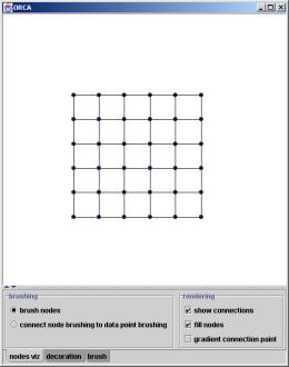
Figure 5. The two Orca plot windows used to investigate the new SOM visualization methods. The plot on the left shows a snapshot of the grand tour, while the plot on the right shows the nodes in feature space.
5 Animation of SOM Algorithm
The first new SOM visualization method is an animation of the algorithm created in the grand tour view. This animation shows the models being positioned in the input space by the SOM algorithm. Figure 6 shows an example, using a 3-D uniformly distributed data set, where the variance of the third variable is very small. The top left plot shows an early iteration, and the algorithm progresses to the end in the bottom right plot. Note that there are many iterations of the algorithm in between these snapshots.

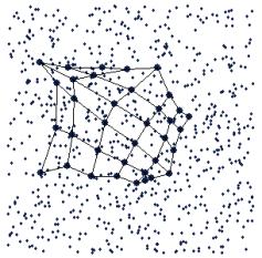
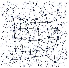
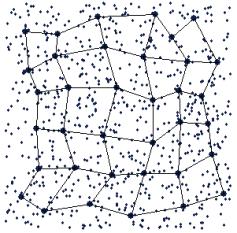
Figure 6. Successive iterations of the SOM algorithm, shown in an animation.
The grand tour (Swayne, Cook et al. 1998) (Buja, Cook et al. 1996) was used as the method of choice for showing the data and models in input space for two main reasons. First, since the training data is multivariate and we want to view the algorithm positioning the models in input space with the data, some projection method is needed. The grand tour is a good method because it shows the data from different angles, allowing inherent structure of the data to be observed. Second, Orca provides trivial access to grand tour projections. Note that the grand tour is not the only possible projection method for visualizing the models and training data in input space; many other methods (PCA, CCA, projection pursuit, Sammon’s mapping, etc.) could have also been used.
When viewed on-screen in real time, you can really see which model is being updated, and “pulling” the rest of the map along with it. This model corresponds to node c (see section 2 Self-Organizing Maps above), and the “elasticity” of the map is controlled by the neighborhood function, n(c,i,k). Also, it is very informative to actually see the models being stretched around the data in input space. The animation therefore provides confidence in the proper functioning of the SOM algorithm. A static plot of the end-results of the algorithm may not provide this certainty.
The animation also provides a means for checking the parameters of the algorithm. For instance, almost all of the models should move towards the data point x during early iterations of the algorithm, while during later iterations only the models corresponding to node c and its immediate neighbors should move, and they should not move very far. If the neighborhood function is not performing this behavior, it can be easily identified during the animation and fixed. Watching the animation helped immensely during debugging of the Jsom code.
6
Linked Brushing Between Grand Tour View and
Map View
Linked brushing (Buja, Cook et al. 1996) is a powerful graphical way of posing queries, or asking questions, about data. Multiple different views of the same data can be linked; a user can then query one view and have the other views provide the response to the query. For example, pair wise scatterplots of a multivariate data set can be graphically linked. The user can then brush data points in one plot to a new color and the same data points in the other plots will be updated to this color as well. In this case, the query is conditioning on the two variables in the first scatter plot. It basically means, “How do variables x1 and x2 affect the values of other variables in this data set?”
Linked brushing can also be used to pose queries about the SOM. By linking multiple views of the SOM, brushing on one view can ask a question which in turn is answered in another view. Three types of linked brushing are described in this paper:
- Brushing nodes and models
- Connecting data point brushing to node and model brushing
- Connecting node and model brushing to data point brushing
These brushing types provide answers to three different questions:
- Where did the algorithm position certain models in the input space?
- Which node(s) in feature space are certain data points projected to?
- Which data point(s) in input space are projected on to certain nodes in feature space?
Brushing nodes in the map view tells you where the models of those nodes are located in the tour view. This is related to the method in (Himburg 1998) except it is interactive. The user can brush any node in the map view to any color, and the corresponding model in the tour view will be brushed in real time. Brushing can also be done on models in the tour view. In this case, brushing tells you the nodes in the map view that the brushed models belong to. This type of brushing can be used to gain more insight into the effects of the SOM algorithm.

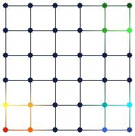
Figure 7. Brushing nodes in the map view (on the right) automatically brushes their corresponding models in the tour view (on the left). This type of brushing tells the user where the algorithm positioned the models in input space.
Figure 7 shows an example of this type of brushing. The SOM algorithm positioned models of the map as shown in the tour view on the left. By brushing nodes in the map view on the right, it is easy to see the corresponding models in the tour view. Another realization is that the algorithm seems to have “flipped” the map. There is no requirement that the SOM algorithm must preserve any relative positions; just that neighboring nodes in feature space should have neighboring models in input space.
The second type of brushing tells you how data points in input space are projected onto the nodes of the map in feature space. The user can brush any group of points in the tour view, and the nodes they are projected on to are also brushed in the map view. For convenience, the corresponding models in the tour view are also automatically brushed.
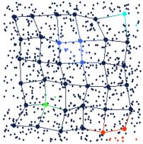

Figure 8. Brushing data points in the tour view (on the left) automatically brushes the nodes they are projected on to in the map view (on the right). This type of brushing tells the user how the data points are projected from input space to feature space.
Several data points in the tour view of Figure 8 have been brushed to different colors and projected on to the map view by linked brushing. This projection is done by simply finding the nearest model to the brushed data point in input space (using the Euclidean distance metric), and brushing the corresponding node in feature space. Thus, the user can interactively project data points from input space to feature space.
The third type of brushing tells you the data points in input space that are projected onto certain nodes in feature space. The user can brush nodes in the map view and all data points projected onto those brushed nodes are automatically brushed in the tour view. Models can also be brushed in this way in the tour view. In this case, all data points that are projected onto the nodes of those models are brushed in the tour view. The corresponding nodes in the map view are brushed as well.
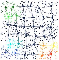
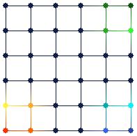
Figure 9. Brushing nodes in the map view (on the right) automatically brushes data points in the tour view (on the left) that are projected onto the brushed nodes. This type of brushing tells the user all of the data points in input space that are projected onto a specific node in feature space.
Figure 9 shows an example of this third type of brushing. Several nodes in the map view have been brushed with different colors (the same colors as in Figure 7). The data points that are projected onto these nodes are automatically brushed in the tour view. This type of brushing can roughly show the “projection boundaries” for the different nodes.
7 Applications
Several examples were presented in the previous section on linked brushing. The data set used in these examples is artificial; it is uniformly distributed in three dimensions, with a much smaller variance on the third variable. Since SOM is useful not only on toy data sets, an example with a real world data set is in order.
The data set presented here consists of various measurements on fleas. It consists of 75 data points (each representing a flea), 6 variables, and contains 3 classes of fleas. The classes of fleas are somewhat easily separated, by watching the grand tour. Each class tends to “move” across the screen in a different direction than the other classes during the tour. Figure 10 shows a snapshot of the tour, where the classes are visually separable.
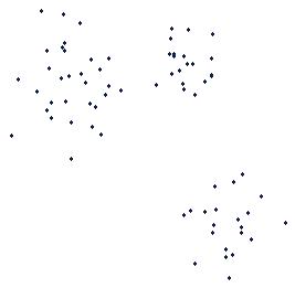
Figure 10. Grand tour projection of the flea data set. The three classes are visually separable in this projection.
After fitting the SOM to this data, the data points in the tour view are brushed according to the classes seen in Figure 10. Figure 11 below shows the results of this brushing in the tour view. The data points are brushed without even seeing the models – the models are only added to the plot after the data points have been brushed.

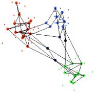
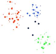
Figure 11. The data points in Figure 10 are brushed according to the visible classes (far left). The models are then added to the tour view, with adjacency connections (middle) and without (far right).
You can see from the middle plot of Figure 11 that there are a much higher number of connections between models within the clusters than there are between models in different clusters. This suggests that the models within the clusters belong to adjacent nodes in the feature space. Naturally, this can be examined from the map view, shown below in Figure 12.
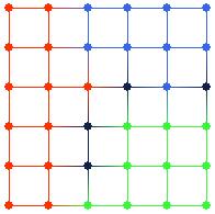
Figure 12. Map view after brushing in Figure 11. Note that the data points in the clusters in input space are projected to adjacent nodes in feature space. Also note the dark-colored nodes, which have no data points projected on to them.
It is very easy to see that data points in the same cluster in input space are projected on to adjacent nodes in feature space from the map view in Figure 12. Also, note that there are four nodes in Figure 12 that have no data points projected on to them, colored with dark blue. These nodes appear to be on the boundaries between the three clusters. Inspecting the tour view in Figure 11 again, it is apparent that these “empty” nodes do in fact lie between the clusters in input space.
By observing the grand tour, visually picking out clusters in the data, running the SOM algorithm, and brushing the data points based on their cluster, a sort of exploratory clustering has been performed. The SOM algorithm seems to agree with the clusters; remember that the algorithm positions the models of neighboring nodes in feature space to similar regions of input space.
When brushing the data points in the tour view, the following query is effectively posed: “Are these data points, which appear to be in the same clusters in input space, projected onto similar regions of feature space?” By observing the response in the map view, where the same colors appear in the same regions of the map and there are “empty” nodes between these regions, the answer is a definite “yes”.
This example shows that the SOM algorithm indeed positions the models in input space in an ordered fashion according to their corresponding nodes in feature space, and preserves distance relations among data points when projecting from input space to feature space. Also, the SOM algorithm has effectively done feature extraction on this data set. Originally, a supervised learning algorithm would have to create decision functions in 6-dimensional input space. However, after non-linear projection by the SOM, the supervised learning algorithm then only has to work in 2-D feature space, greatly simplifying the learning task. It is also obvious from the map view in Figure 12 that the projected classes are linearly separable in feature space.
8 Conclusions
This paper has presented two new methods for visualizing Self-Organizing Maps. The first, based on an animation of the SOM algorithm (or learning process) and the grand tour shows how the algorithm positions the models in input space to approximate the data’s distribution. The second method uses linked brushing between two different views of the SOM to allow a user to pose queries about the mapping between input space and feature space. Examples using two different data sets show the effectiveness of these two new visualization methods.
Although the tour view and map view are both good visual representations of the data and the SOM, they are definitely not the only possible informative plots. Many other ways of visualizing the data and models in input space are possible. These other views could also utilize the two new SOM visualization methods: they could show the animation of the SOM algorithm, and provide linked brushing between all of the views. Orca provides this linking capability, and the Jsom package handles the SOM algorithm. All that is needed for new input space views are new Orca pipe sections that perform the appropriate projection from input space to 2-D and render the data and models to the screen.
9 References
Bloch, J. (2001). Effective Java: Programming Language Guide. Boston, Addison-Wesley.
Buja, A., D. Cook, et al. (1996). "Interactive High-Dimensional Data Visualization." Journal of Computational and Graphical Statistics 5(1): 78-99.
Gamma, E., R. Helm, et al. (1995). Design Patterns: Elements of Reusable Object-Oriented Software. Boston, Addison-Wesley.
Hastie, T. and W. Stuetzle (1989). "Principal Curves." Journal of the American Statistical Association 84(406): 502-516.
Himburg, J. (1998). Enhancing SOM-based data visualization by linking different data projections. Proceedings of the International Symposium on Intelligent Data Engineering and Learning (IDEAL '98), Hong Kong.
Kaski, S., J. Venna, et al. (1999). Coloring that reveals high-dimensional structures in data. 6th International Conference on Neural Information Processing.
Kohonen, T. (2001). Self-Organizing Maps. Berlin, Springer.
Sutherland, P., A. Rossini, et al. (2000). "Orca: A Visualization Toolkit for High-Dimensional Data." Journal of Computational and Graphical Statistics.
Swayne, D. F., D. Cook, et al. (1998). "XGobi: Interactive Dynamic Graphics in the X Window System." Journal of Computational and Graphical Statistics 7(1): 113-130.
Vesanto, J. (1999). "SOM-Based Data Visualization Methods." Intelligent Data Analysis 3(2): 111-126.